
Ranck Website Redesign:
Aligning UX, SEO & Brand Voice
Client:
Ranck Plumbing, Heating, AC & Excavation
Project Overview
Ranck's website had become outdated and no longer aligned with its brand or customer experience goals. As a trusted home services provider since 1953, the company needed a modern, mobile-friendly site to improve usability, brand consistency, and lead generation.
My Role:
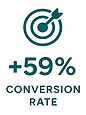
Managed the outsourced $40K website redesign from strategy to execution—leading UX planning, creative direction, and project timelines to boost traffic by 50% and improve user engagement by 30%.

Impact
-
Improved user flow and service findability
-
Increased quote requests through clear CTAs
-
Boosted SEO rankings for core services
-
Strengthened brand presence across digital channels
Tools & Skills Used
-
UX/UI Wireframing & Design
-
WordPress Platform
-
HTML/CSS/Javascript
-
Content Strategy
-
Cross-Team Collaboration
-
Brand Application
The Challenge
Mobile Usability Issues
The old site wasn't responsive, making mobile navigation frustrating.

Inconsistent Branding
Fonts, colors, and imagery didn't align with Ranck's identity.

Poor SEO Structure
Key services were buried and didn't support local search rankings.

Difficult Navigation
Complex structure and menus made it hard for users to find service information.
Research & Direction


Working closely with the CEO, I led a 5-month evaluation process to select the right agency for Ranck’s website redesign. We interviewed four marketing groups and presented a creative brief outlining the project’s core priorities:
-
Mobile-first design
-
Simplified navigation
-
SEO-friendly structure
-
Visual brand consistency
-
Strategic call-to-action placement
After conducting discovery calls and reviewing proposals, I narrowed the choices down to 3 options, presenting a comprehensive comparison to the executive team—summarizing each agency’s approach, strengths, pricing, and fit with our long-term goals. By month six, we selected a partner and began the redesign.
A major technical issue discovered: I had discovered that Ranck no longer owned its primary domain due to past company ownership changes. I immediately worked with the CEO, legal team, and former stakeholders to recover domain ownership—an essential step before proceeding with development.
This early strategic groundwork laid the foundation for a smooth build phase—ensuring the selected group fully aligned with Ranck’s brand, budget, and digital growth goals.
The Solution

Unified Brand and Visual Identity
Established consistent fonts, colors, and styling across all pages.

Simplified Navigation by Service
Streamlined how users access core service areas for a smoother experience.
Updated Visuals
Refreshed photography and iconography for better clarity and engagement.
Clear CTAs for Quoting & Booking
Designed prominent call-to-action buttons to guide users toward scheduling services or requesting quotes with ease.
Optimized for SEO & Mobile
Structure rebuilt to perform well across devices and support search visibility.

Outcome
The redesigned site now reflects Ranck's professionalism and commitment to quality service. It enhances the customer experience across devices and supports continued digital growth.


Data is based on numbers analyzed across the last 12-14 months.